COMMUNICATION DESIGN
Fictional Rebranding of DISTRICT 2020
Designing a rebrand for District 2020, the legacy project of Expo 2020 Dubai, was a heartfelt desire for me and a stepping stone in the desired professional direction. When I introduced the project to my fellow students, I was shown some challenges by the seminar group and was made aware of highlights that could be brought out more effectively than it was the case in the current branding. I got confronted with sustainability issues and a conservative culture, and I questioned why their advancements were not prominently featured. As a result, I came up with a communication concept that goes hand in hand with a holistic brand image.
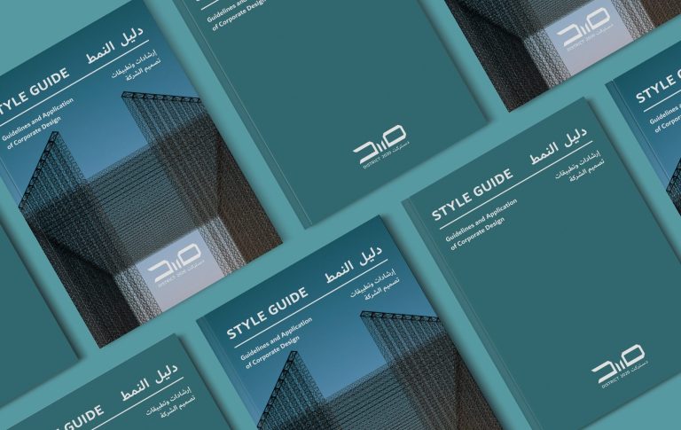
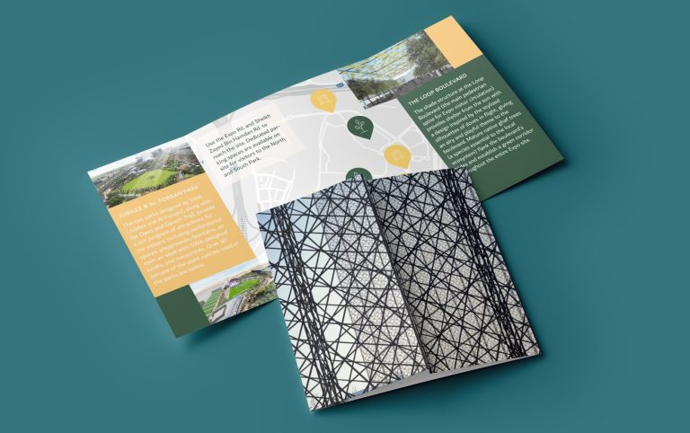
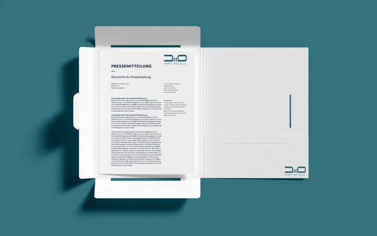
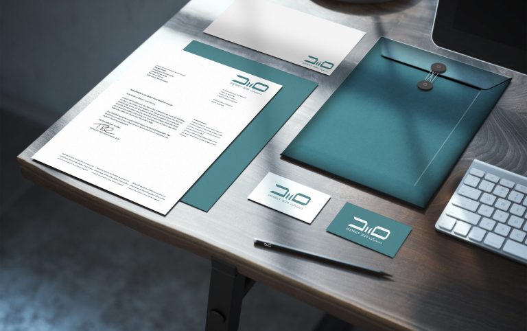
It comes with a Style Guide of 60 pages, layed out in a bilingual format with guidelines for an exclusive Corporate Design including a new logo, signage, a brand new set of icons for services or public landscape and means of communication for different usage of media and audiences.
Different channels can be used in a consistent way to reach different target groups in a homogenous manner and convince them of the district's vision. The motives behind the different components are explained in detail in the style guide.
P.S.: This project has been realized in winter 2020/21. It was announced during a press conference in June 2022 that the Expo 2020 site will not be renamed District 2020, but instead will be known as Expo City Dubai.
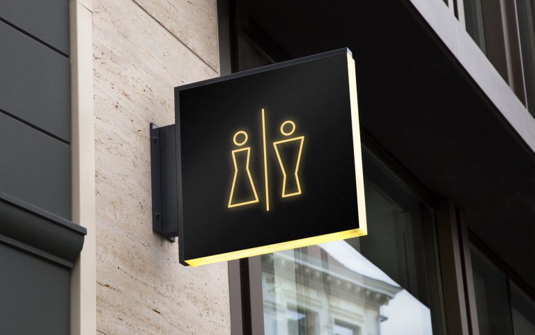
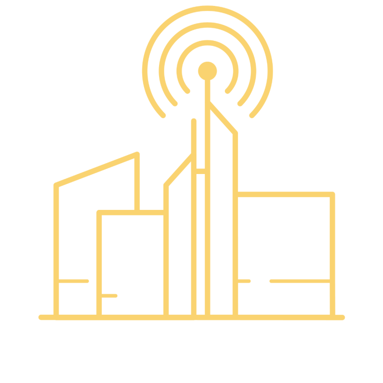
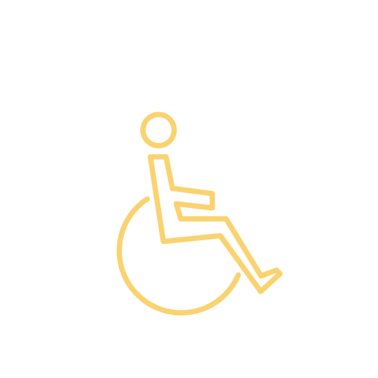
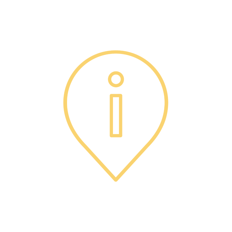
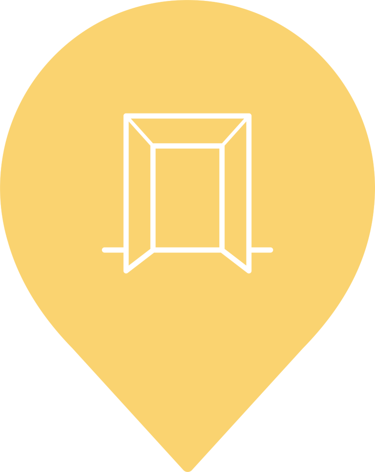
All icons are based on the corporate colors and the same design grid. The grid derives from the architectural Mashrabiyya style of the district’s three entrance gates. The icons support communication in media and in the public cityscape and act as eye-catchers to draw attention to further information or locations.
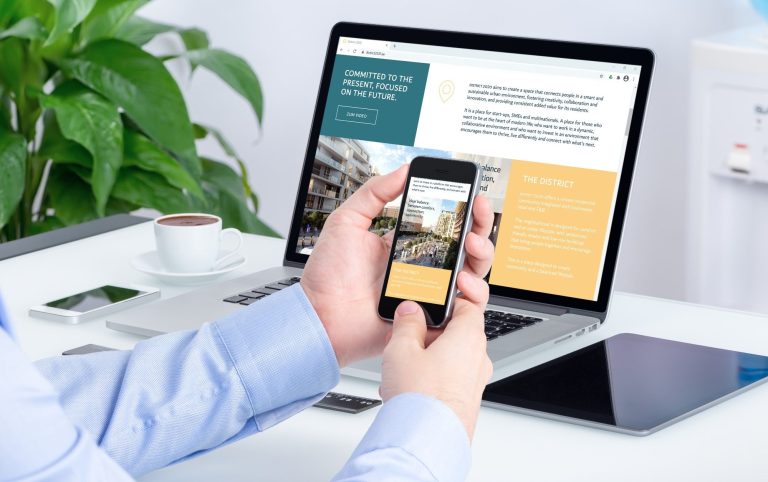
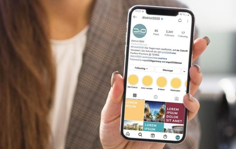
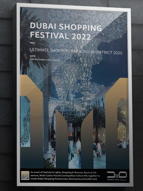
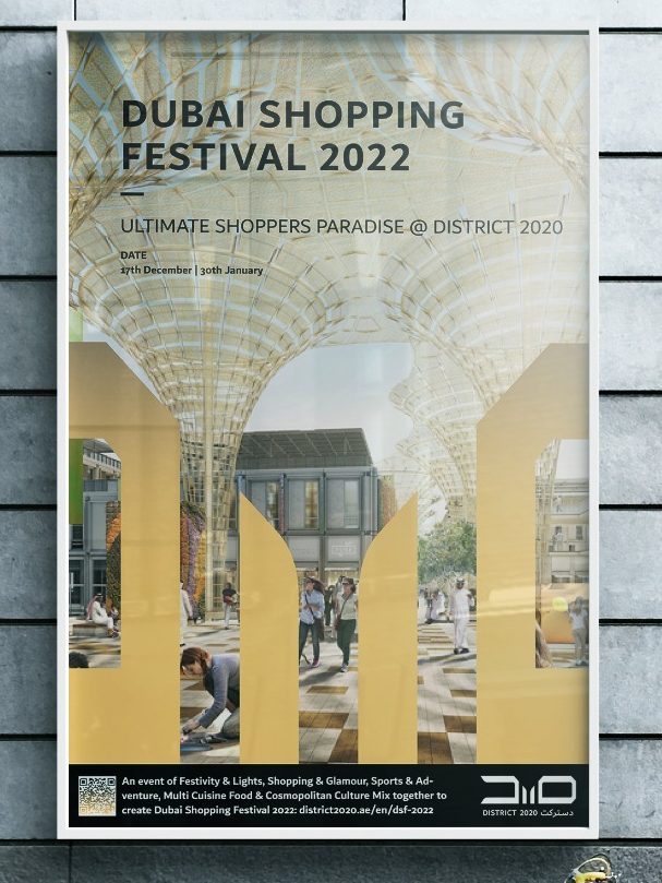
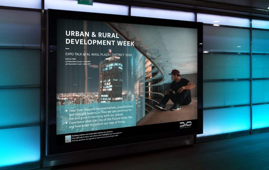
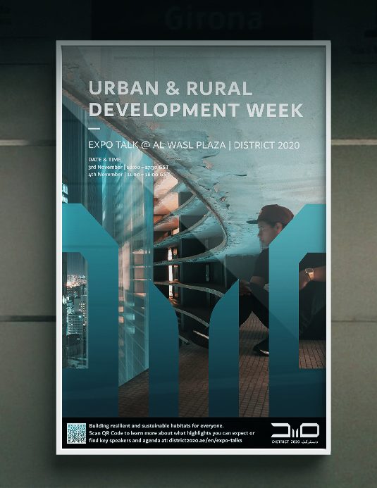
Due to their grid-based nature, the icons place themselves ideally into the place branding and thus have a uniform effect in the overall image of the city. Below are some examples of the visual communication tools.
The brand of District 2020 corresponds to the young spirit of the creative potential and directly offers what both residents and companies need for their visions: A destination where people, languages and cultures connect to create endless possibilities for business, tourism and leisure.
The design components outlined in the Style Guide support this vision and provide opportunities to communicate with its audiences at a wide variety of interfaces. Be it in the cityscape, on social media, on the web or in the press.
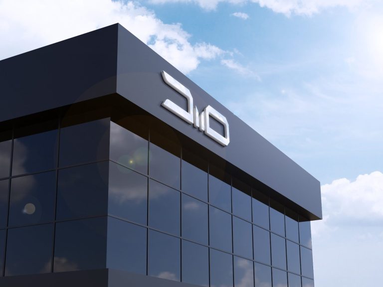
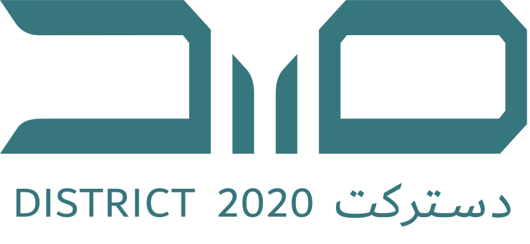
Derived from ‘D2O’, which is the district designation used in everyday life (‘D-Twenty’ or ‘D-Two-O’), the element deuterium oxide (D2O) can be seen worldwide as a symbol for the energy source of the future and is thus representative of the urban vision from the sustainable source in the desert. It is the ideal inspiration for the logo of District 2020. As the gateway between East and West, the city name of District 2020 forms the foundation of the logo and underpins with its bilingualism the cultural values for which the district stands.
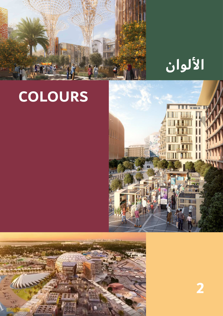
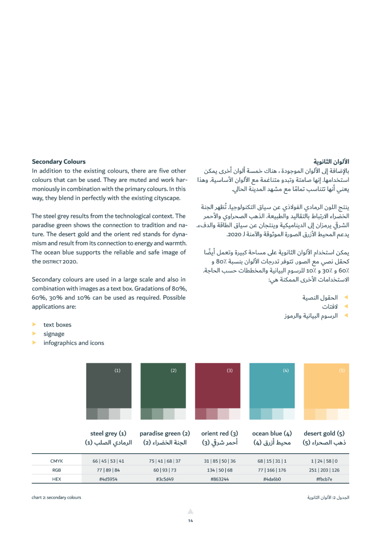
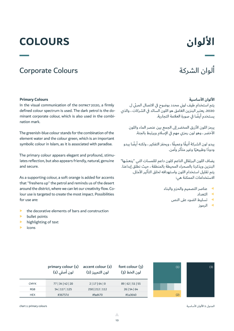
Excerpt from the style guide, chapter 2 on colours:
Client: University Project for Expo Dubai Group (fictional)
Skills: Localization, Place Branding, Brand Development, Design System, Logo Design
Doe in Boots Design
© 2018-2023 Tina Rehschuh. All rights reserved. Imprint. Privacy Policy.
All contents of this online portfolio, especially concepts and prototypes, but also texts, photographs and graphics, are protected by copyright. The copyright belongs to me, Tina Rehschuh, unless explicitly marked otherwise. Please ask me if you would like to use the contents of this website. Or even better - let us develop the presented ideas together!
Wir benötigen Ihre Zustimmung zum Laden der Übersetzungen
Wir nutzen einen Drittanbieter-Service, um den Inhalt der Website zu übersetzen, der möglicherweise Daten über Ihre Aktivitäten sammelt. Bitte prüfen Sie die Details und akzeptieren Sie den Dienst, um die Übersetzungen zu sehen.
